AST – Week 4 Responses
Design Meets Disability: “Feeling Meets Testing”
The role of design is broadening, and even a user-centered approach to design is no longer focused on issues of usability alone, but on the overall experience being created.
The idea of the “minimum viable product”, popularized in the startup community by Eric Ries, describes the simplest functioning version of your product. Launching at this stage (sharing working prototypes in public to gather feedback, the opposite of an approach like Apple’s where everything is behind closed doors) has many advantages for design: gathering general feedback, foreseeing side effects, or even seeing what could potentially be offensive/insensitive. But an under-appreciated aspect of prototyping in public I realized during this reading is accessibility. As diverse a team as one could build, especially in a small organization/company, no team can ever personally test for every kind of condition & ability & background. (That said, most companies don’t try nearly hard enough in this area, but setting that aside…) Prototyping in public allows gathering feedback specifically on the accessibility of a product from a much wider range of users in a much wider range of life situations. Especially if you’re creating a product especially for the purposes of accessibility, that’s invaluable.
Building Access
Growing up in a post-ADA world, where parking lots have accessible slots, there are curb cuts (which seems to be an obviously-better design for pedestrians as well), and accessible stalls in public bathrooms, I kind of assumed we’d solved accessibility issues for people in wheelchairs. (With all our money & design capabilities & intelligence, surely we should have?) It’s been depressing to realize as I’ve gotten older that no, the world is not accessible for people using wheelchairs, and neither is it equitable, nor just for queer and trans people, nor for people of color and poor people, etc.
…curb cuts as benefiting “everyone” or “many people” reproduces an often-told story about accessible design and disability.
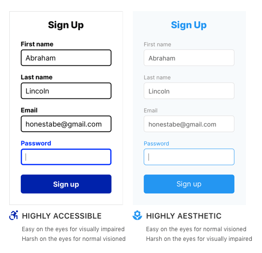
There’s this astonishingly-widespread idea among designers that accessibility and visual/aesthetic beauty are at odds with one another. This is wrong, harmful, and stupid, yet far from the conceptual graveyard. In November, UX Movement published an article showcasing designing a web form, including this graphic:

Not only is the accessible design both easier for everyone (including me, with 20/20 vision), it’s more visually interesting, proving these supposed opposites are far from it. @typodactyl wrote an excellent response analyzing the shortsightedness of this argument.
Designing Disability: Symbols, Space, and Society – Ch 7
I remember hearing about the improved wheelchair access/accessibility sign when it was first released, and appreciating the effort behind it. (The old icon always felt rather stagnant.) Reading the story of how it came to be was super interesting. I am disappointed to see the open door icon never went further—as an icon, I think it needs some graphic refinement, but the idea is fantastic (“a ‘welcoming’ or ‘barrier-free’ environment in a ‘strong, positive, symbolic connotation’”). Every week on Design Industry Twitter I see another example of a toggle for “accessibility mode” or some other stupid design. What we need instead is more welcoming environments, where the door is open to all.