Spatial semantic Twitter search
I’ve combined my 1) desire to re-surface content from my Twitter feed 2) embeddings & semantic search and 3) my love of infinite canvas UIs:
It’s an OpenAI embeddings-powered search tool for my Twitter likes & bookmarks, with advanced filtering, on an infinite canvas with draggable results.
The codebase is all open source here.
Background
I’m a Twitter power user. I’ve met many of my closest friends through Twitter, and owe much of my career to it. This past month I crossed 10 years on Twitter, and over the course of this project I crossed 300,000 liked tweets, and countless bookmarks. All these tweets meant something to me, but the onslaught of newness means they’re rapidly forgotten.
Twitter knows me wildly well, and no one else in the world has my exact feed: a mix of many kinds of design, web dev, tech news, Apple, pop music, queer media, climate science, environmental policy/politics, and so much more. My feed is wildly compelling to me, which is why I spend so much time there.
I’m intrigued that social networks calculate so many factors on posts/people—which is why they’re so good at recommending content—but compress all this metadata into one number: the ranking of posts in your feed for any given session. This project is trying to explode back out the gems of my Twitter feed into multiple dimensions. It’s an advanced semantic search tool for my Twitter likes + bookmarks, using an infinite canvas spatial UI to make it a tool for grouping thoughts together.
The elements of this project came from a few sentiments in the water recently. On the Twitter side:
- @m1guelpf made the new Perch app, which is a similar concept of filtering through Twitter likes
- In the middle of working on this project, Clipmate also launched for semantic search of Twitter bookmarks
- @kaseyklimes imagined a monthly zine of Twitter bookmarks
Infinite canvases are in.
- @Wattenberger shared an exploration the medium
- Obsidian standardized the format with JSON Canvas
- @jsngr & the Diagram team are exploring it as UI for AI collaboration
- @JacobColling explored using Obsidian’s for LLM branching conversations
- @craigmod wondered about bringing the paradigm to more types of software
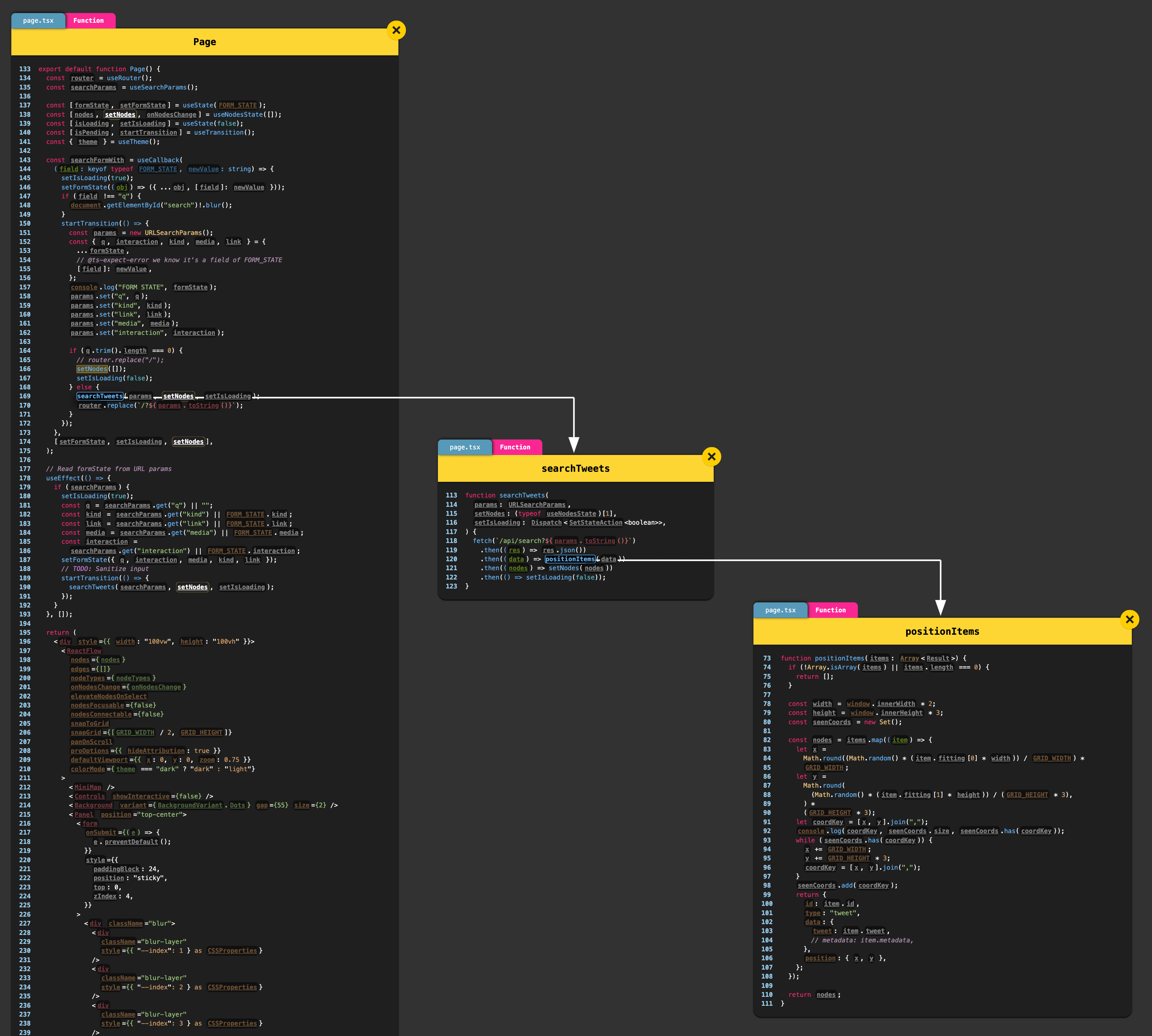
- @fronseneca shipped a VS Code plugin Spectral to explore your code on an infinite canvas (seen below with some of the haphazard code of this project)
Data download
I began by trying to reverse-engineer how the Twitter web client renders its feed. Inspecting my Network tab in the browser devtools, I found the Bookmarks endpoint, which is a long GraphQL query. Chromium provides a handy Copy as fetch (Node.js) command that makes replicating the network request, with all the authentication headers & cookies, easy.

Next, I began a Bun script, which I was new to using but I wanted to try its file I/O APIs, since I always find Node.js’s frustratingly difficult to use correctly. I rapidly assembled a script to download the bookmarks results & save them to JSON.
I needed this project to download all relevant text data from Twitter for use in the indexing process, which luckily the GraphQL endpoints return. Unfortunately, the data structure is a nightmare for my use case:
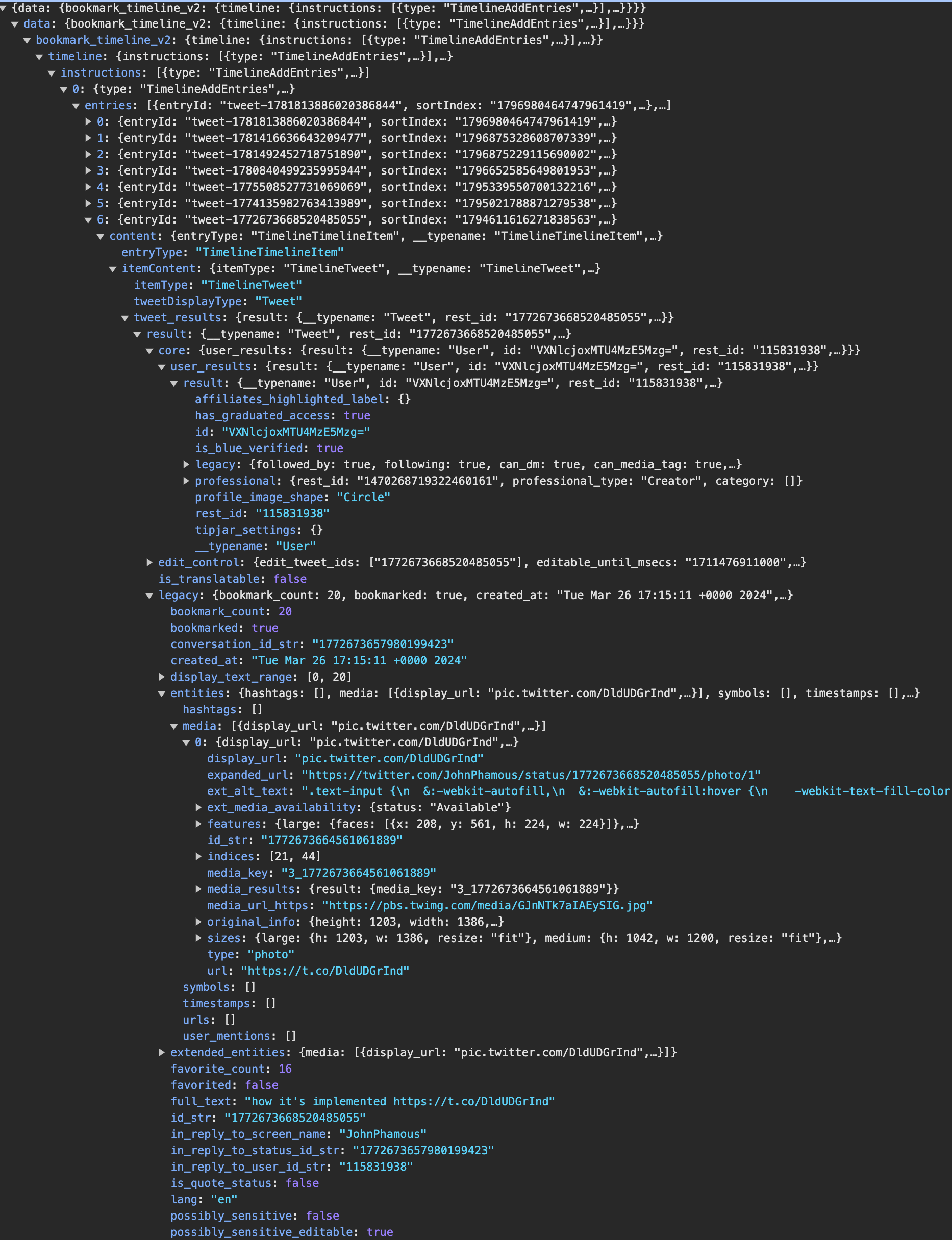
The scripts I found online for handling Twitter endpoints weren’t up to date with the current structure, so I built mine myself. Vercel maintains a library called react-tweet that allows embedding tweets in a React app without using the client-side script Twitter makes, which causes layout shift, has no styling options, and causes significant performance issues at scale. I needed to finagle the data stream into the payload its React component is expecting, which took a number of hours of iterations. I save all the data to JSON files locally.
I use the code editor Zed, and I tried out the Zed Tasks feature to tie running the Bun script to a hotkey for faster iteration speeds. Big fan, will use again.
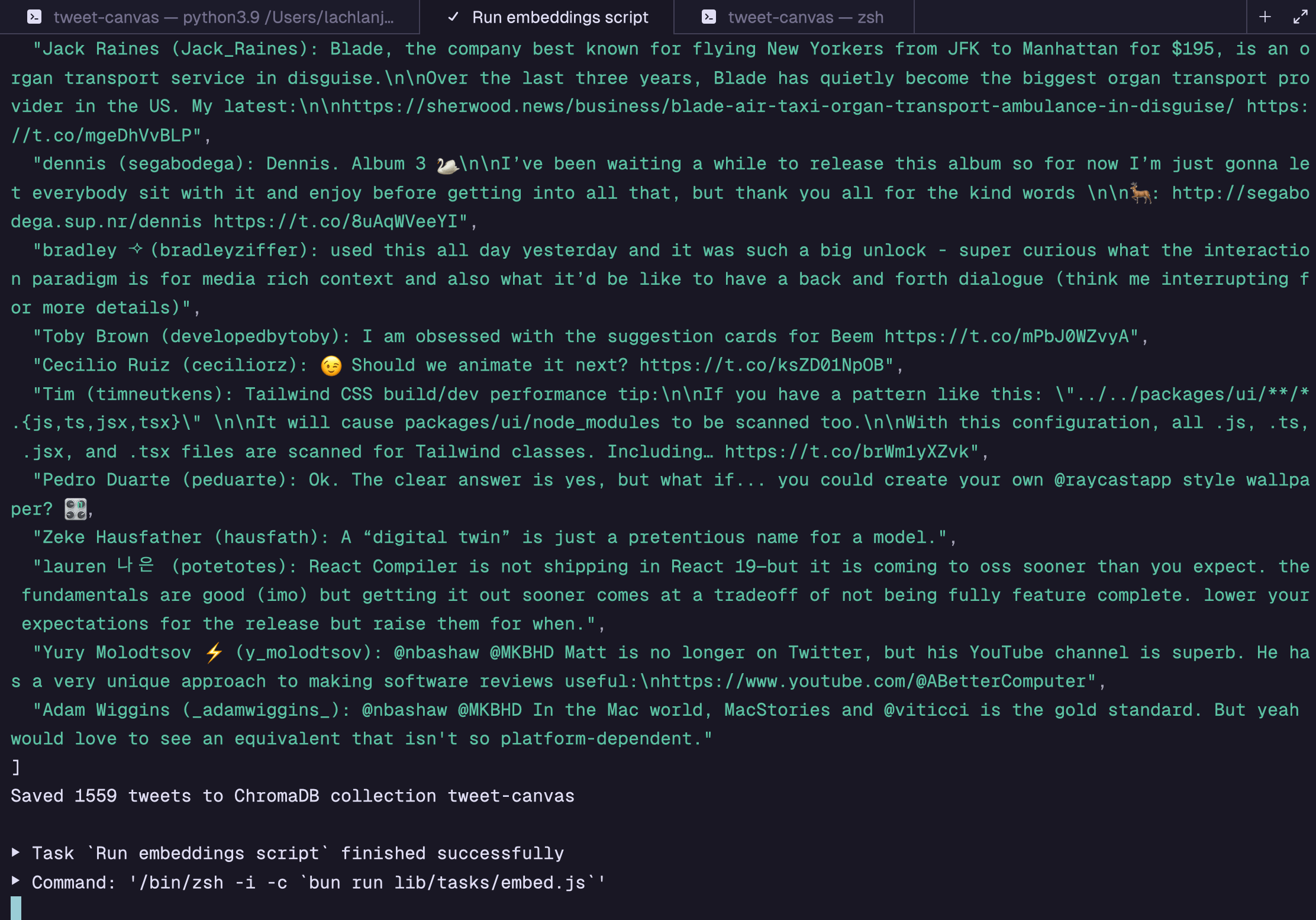
After downloading the tweets comes embedding. I made a separate Bun script which pulls out the tweets, then collates the text of:
- User username
- User display name
- Attached URLs
- The text of the tweet
- Alt text from media attachments
Into one string. It runs OpenAI embeddings on these strings, then adds them to ChromaDB as a local vector database.
Frontend explorations
I started by copying over much of the code from my recent Search Canvas project, which had similar needs across the frontend and endpoint for the frontend. The basic structure is:
- A search text input on the frontend
- Submits to a backend endpoint that queries ChromaDB and groups the results using UMAP
- A React Flow infinite canvas renders the nodes
react-tweetrenders the tweets
For the backend endpoint, the code from Search Canvas needed little modification. I wrote that project under the Next.js Pages Router, and for some reason, bringing the exact same code to query ChromaDB over to a Next.js App Router Route Handler caused the server to fail every time. I moved that one endpoint to the Pages Router & it worked fine. I didn’t sweat it since it makes no difference to users.
Here was my first iteration of the project, once all these pieces were fit together:
User testing
Testing with some classmates, I got great feedback across a number of areas:
- The pixel-precise movement of tweets across the canvas meant the tweets were often overlapping and difficult to move around. Zhiyang suggested a masonry layout, or some sort of snapping.
- Suggested searches: folks weren’t sure what to search for in a corpus of my data
- Filters: how do you further narrow down these results?
- Reasoning for the ordering/positioning of results is unclear. Can they be grouped with text labels?
- I noticed people struggling with the browser trackpad gestures for two-finger swipe back causing people to lose their place
Filters
Filters seemed like a key first step to narrow results. I came up with four axes of filtering:
- Tweet type: standard, reply, quote tweet
- Media: image, GIF, video attachments
- Links: URLs, hashtags, mentions
- Interaction: bookmarked, liked, retweeted
A general engineering principle I have in Next.js projects is to move logic as far up the stack as I can; build scripts over server endpoints/rendering/components over client. In my embed script, I added basic heuristics based on the JSON of tweets, so Chroma could handle filtering for me; if I handled the filtering outside the search, I’d have to gather many more results from Chroma, then potentially return too few once that set was filtered. Chroma doesn’t support boolean types, so I convert the boolean values to numbers:
await collection.add({ids: tweets.map((i) => i.id_str),metadatas: tweets.map((tw) => ({isReply: Number(tw.in_reply_to_status_id_str !== null ||tw.in_reply_to_user_id_str !== null,),isQuote: Number(tw.is_quote_status),hasVideo: Number(tw.mediaDetails?.some((med) => med.type === "video")),hasGif: Number(tw.mediaDetails?.some((med) => med.type === "animated_gif")),hasImage: Number(tw.mediaDetails?.some((med) => med.type === "photo")),hasLink: Number(tw.entities.some((ent) => ent.type === "url")),hasHashtag: Number(tw.entities.some((ent) => ent.type === "hashtag")),hasMention: Number(tw.entities.some((ent) => ent.type === "mention")),bookmarked: Number(tw.bookmarked),favorited: Number(tw.favorited),retweeted: Number(tw.retweeted),})),documents,});
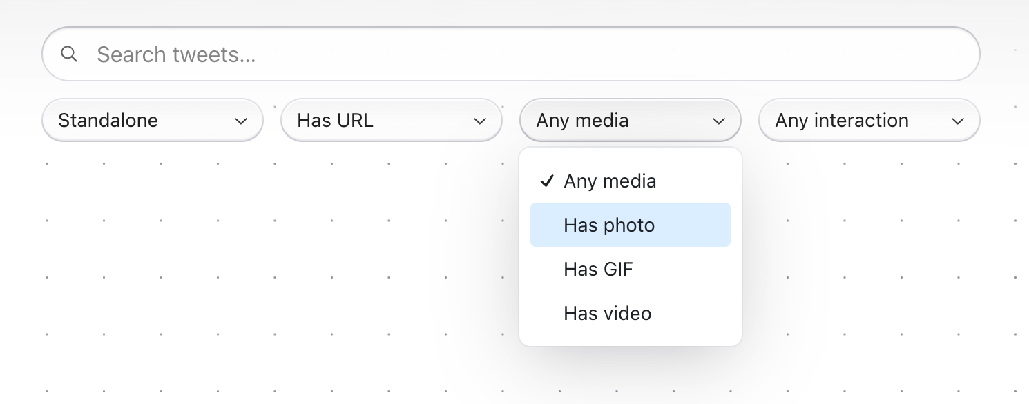
I then had to write some UI, and upgrade the search endpoint. I used the Radix Themes Select component for the frontend, then mapped each of the selected filters in the UI to a different combination of metadata filters (for example, a “standalone tweet” type means isReply & isQuote are both false). These filters then have to be transformed into a Chroma metadata query, along the lines of:
const where: Where = {$and: Object.entries(filters).map(([k, v]) => ({[k]: { $eq: Number(v) },})),};
This took a few hours to piece together in total. Here’s the UI:
Suggested searches
Suggested searches came together quickly. Since the project only has my liked tweets, I found some topics that had intriguing results & labeled them across the bottom of the screen before you search anything:

Layout
The infinite canvas layout issue was the chunk I spent the most cycles on. I liked the ability to move the tweets around on the canvas, but the overlapping made it hard to sift through visual results rapidly. Having recently read about the upcoming CSS Masonry Layout, I made another page in the Next app that removed the infinite canvas in favor of a masonry grid.
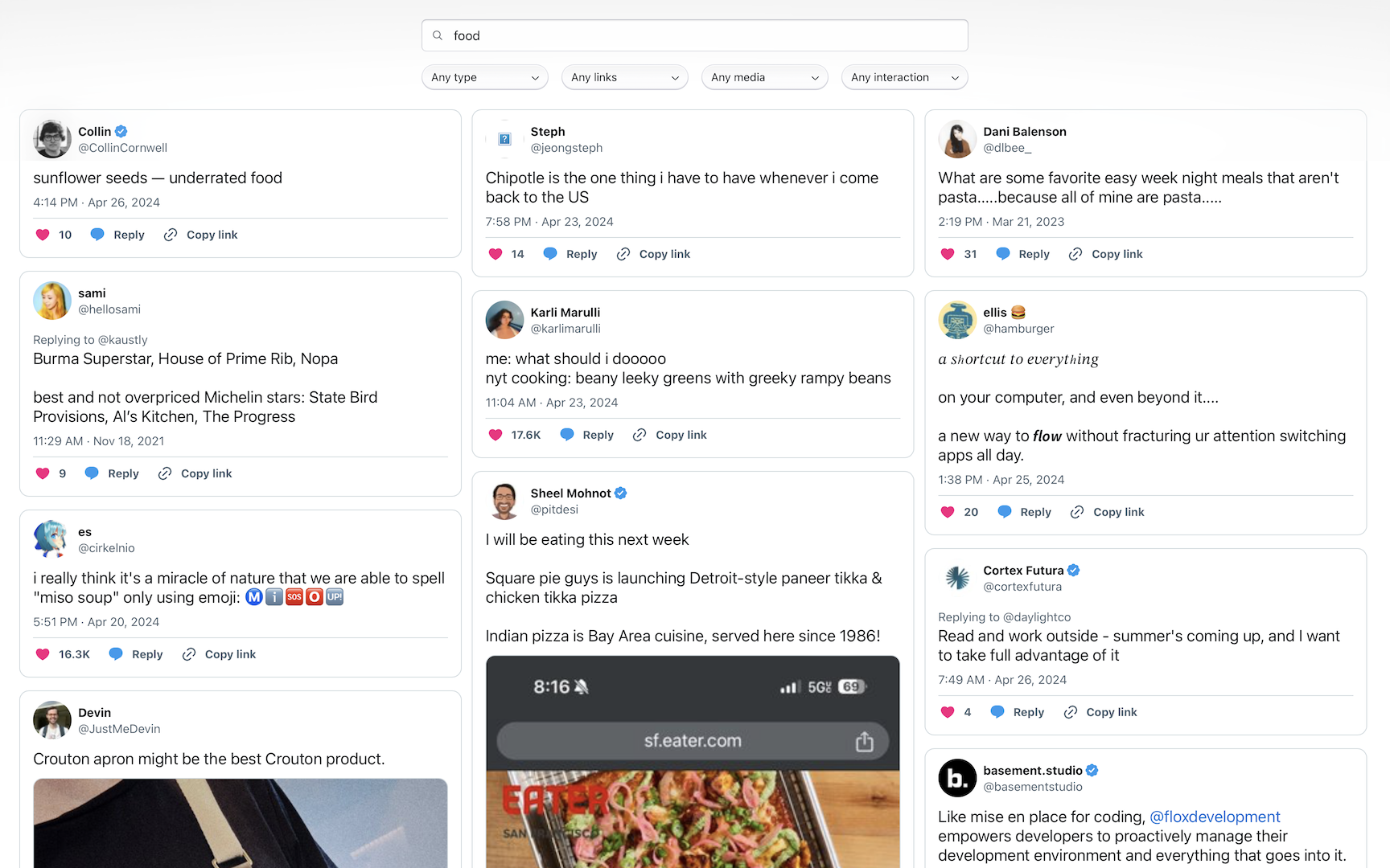
It did solve the overlapping, but it removed two crucial pieces of my idea: meaningful grouping in space beyond the ranking, and the ability to move content around yourself. It felt like a 3-column view of the existing Twitter search, not something radically better. I had to abandon this idea, and think about how to make the infinite canvas view better.
Part of the problem, I realized, was the pixel-level precision that tweets were laid out on, and the drag interaction. I discovered a quick fix to the latter, providing half-tweet-width coordinates to React Flow so when tweets were dragged, they’d snap to precisely half the width of a tweet with some margin around it. The height was more challenging, since the tweets are of variable height. Since the tweets are 550px wide, I decided to use increments of 55px as the margin and distance between dots on the background. For the height, I went with three increments of this scale.
const [GRID_WIDTH, GRID_HEIGHT] = [550 + 55, 55 * 3];
The overlapping issue I could partially solve with two new aspects in my positionTweets function: rounding the x/y coordinates to the same grid width/height (simple arithmetic), and preventing any tweets from starting at the same x/y coordinates (using a Set & while loop). This can’t be fully be solved—without incredibly complex offscreen rendering and sizing code—because I can’t know how tall tweets will be on the canvas before they’re rendered, and the positioning code must run before they’re rendered. I decided my intervening measures were good enough for demo.
UI
I wanted to upgrade the UI, so I added Radix Themes for easily stylable, accessible UI components. I paired it with next-themes for a quick dark mode. I upgraded React Flow to its v12 beta to use its dark mode, which I connected to next-themes.
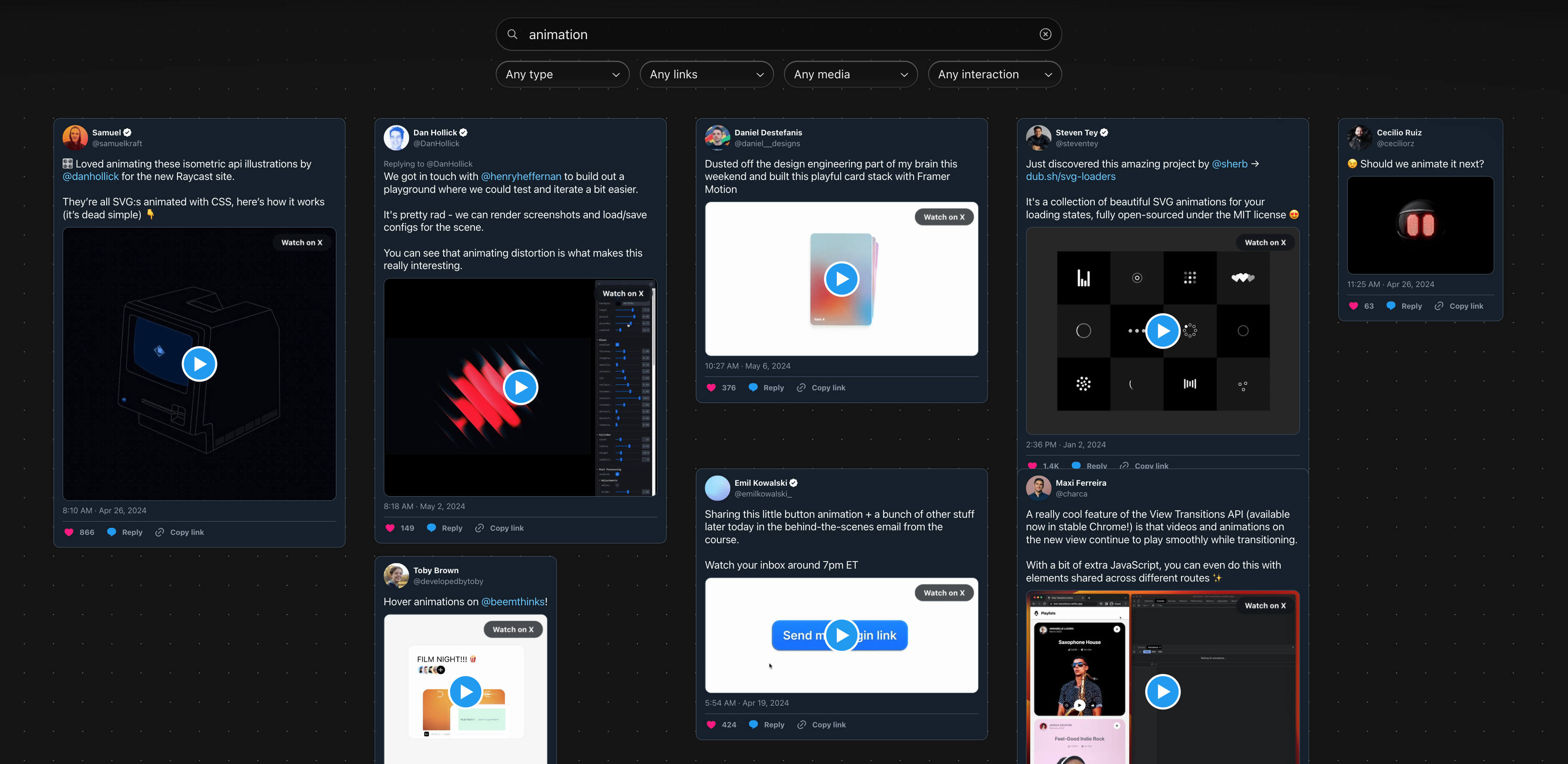
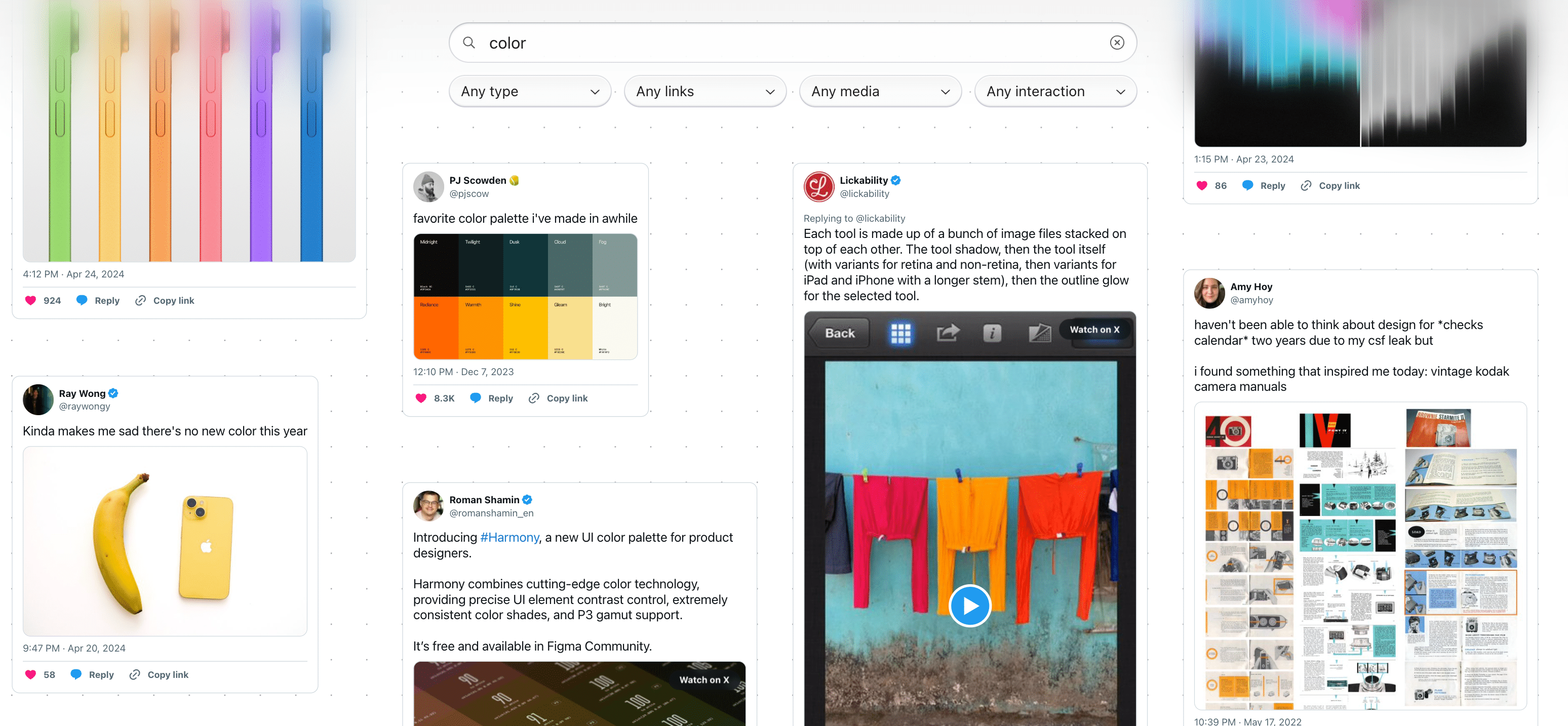
A remaining question after switching back to the infinite canvas was how to separate the filters/search UI from the content area. A sheet seemed inelegant, since it’d block the content, but only having shadows on the filter UI components made them blend in too much with the content area.
I tracked down this CodePen’s implementation of CSS-only progressive blur, which uses multiple stacked blur layers to produce a simulation of progressive blur. I extracted its core components and re-implemented them in my TypeScript/CSS, which I’m super happy with:
Future
This project worked great for a demo, but there’s two blockers to it going to production:
- Authentication/data fetching. To make this easy for other people to use, I’d need to either 1) use the Twitter API, which costs $100/mo for a low-scale product I don’t think could generate that kind of revenue (in addition to the hosting & OpenAI costs) or 2) hack around the backend by insecurely storing user credentials.
- ChromaDB hosting. The cloud version of ChromaDB isn’t GA yet, so I’d need a VPS to run it myself, or else switch to another vector database.
In the meantime, I’m hoping to automate the data scraping for myself, by making my script automatically trawl each timeline endpoint and use the cursor system to successively fetch every page of data historically. I could host the project with just my data feeds all on one VPS, but even $5/mo seems like a lot to spend on this product.
I’d love to add saved/shareable snapshotting of canvases; let me remove results, reposition a collection of tweets, and share a link (that’d be so much better than my list of links in the first section!). Since the infinite canvas takes you out of time, I’d like to explore adding a scrubbable timeline along the bottom, along the lines of @rauno’s recent explorations, which would function as both data visualization and navigation.